Node-RED – Plugin – Dashboard
Node-RED Dashboard
Een mooie plugin met welke je een UI dashboard kan maken, project @ Github

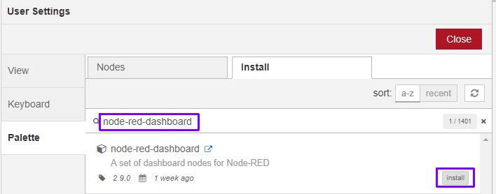
Installatie via Menu > Manage Palette > Tab install en zoek:
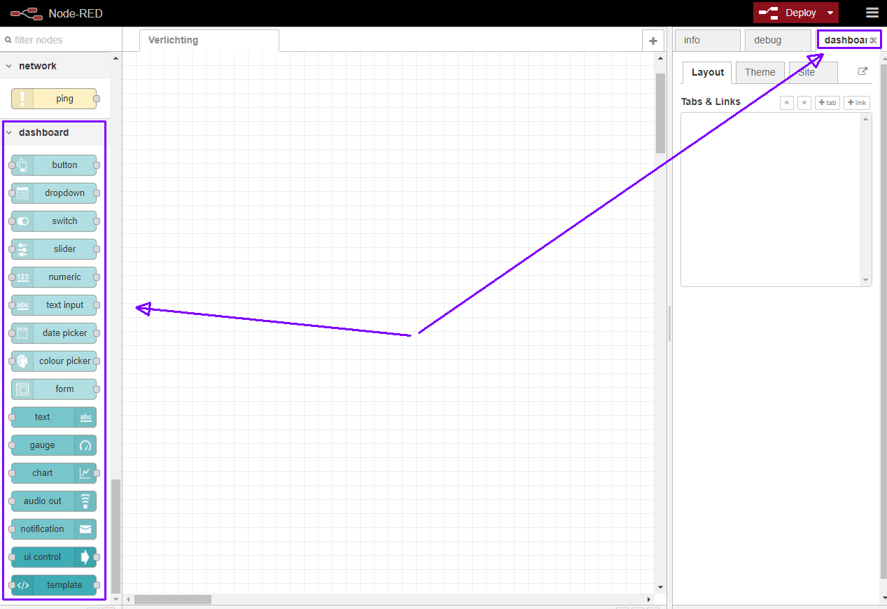
Nodes:
Dashboard benaderen
Het dashboard draait op: http://raspberrypi.local:1880/ui/
Layout
The dashboard layout should be considered as a grid.
Each group element has a width – by default 6 ‘units’ (a unit is 48px wide by default with a 6px gap).
Each widget in the group also has a width – by default, ‘auto’ which means it will fill the width of the group it is in, but you can set it to a fixed number of units.
The layout algorithm of the dashboard always tries to place items as high and to the left as they can within their container – this applies to how groups are positioned on the page, as well as how widgets are positioned in a group.
Given a group with width 6, if you add six widgets, each with a width of 2, then they will be laid out in two rows – three widgets in each.
If you add two groups of width 6, as long as your browser window is wide enough, they will sit alongside each other. If you shrink the browser, at some point the second group will shift to be below the first, in a column.
It is advisable to use multiple groups if possible, rather than one big group, so that the page can dynamically resize on smaller screens.
Features
Dashboard sidebar
The widget layout is managed by a dashboard tab in the sidebar of the Node-RED editor.
Layout
- Tabs – From here you can re-order the tabs, groups and widgets, and add and edit their properties.
- Links – to other web pages can also be added to the menu. They can optionally be opened in an iframe – if allowed by the target page.
Theme
- Style – the theme and font of the UI is set in the dashboard sidebar. You can select a default Light, Dark or Custom Theme. You cannot have different themes for each tab.
Site
- Title – the
titleof the UI page can be set. - Options – optionally hide the title bar, and allow swiping sideways between tabs on a touch screen.
- Sizes – sets the basic geometry of the grid layout in pixels. The width and height of widgets can be set, as can the width of groups. These are the basic definitions of the “units’ used elsewhere within the dashboard.
Widgets
Group labels are optional.
Most widgets can have a label and value – both of these can be specified by properties of the incoming msg if required, and modified by angular filters. For example the label can be set to {{msg.topic}}, or the value could be set to {{value | number:1}}% to round the value to one decimal place and append a % sign.
Each node may parse the msg.payload to make it suitable for display. This converted version is exposed as the variable called value, (see example above).
Any widget can be disabled by passing in a msg.enabled property set to false;. Note: this doesn’t stop the widget receiving messages but does stop inputs being active and does re-style the widget.
Most ui widgets can also be configured by using a msg.ui_control message – see config-fields.md for futher details.
- Audio out – a widget that will let you play audio (wav or mp3) or send Text to Speech (TTS) to the client.
- Button – the icon can be set using either Material or fa-icons – the colour and background colour may also be set. If the widget is sized to 1 wide the icon has precedence.
- Chart – has both line, bar and pie chart modes. Also the X-Axis labels can be customised using a date formatter string. See this document for more information on the chart data formats accepted.
- Colour Picker – a colour picker widget.
- Date Picker – a date picker widget. The displayed Date format can be specified in the Site tab using moment.js formatting.
- Dropdown – a dropdown select widget has been added. Multiple label, value pairs can be specified. The choices can also be set via
msg.optionscontaining an array of objects. If just text then the value will be the same as the label, otherwise you can specify both by using an object of “label”:”value” pairs :
12[ "Choice 1", "Choice 2", {"Choice 3": 3} ]
Settingmsg.payloadwill pre-select the value in the dropdown. - Form – a widget that can be composed of several sub-widgets. When submitted all values are submitted as a single message.
- Gauge – has 4 modes – standard (simple gauge), donut (complete 360°), compass, and wave. You can also specify the colour range of the standard and donut gauges.
- Notification – creates alerts to the user – can either be a toast popup, or a dismissable alert box. The alert may be targeted to a single user.
- Numeric – a Numeric input widget with up/down buttons.
- Slider – a simple horizontal slider, with variable step size.
- Switch – can also set two icons and/or colours depending on state.
- Template – the template node allows the user to specify and create their own widgets within the framework using HTML, Javascript. This is an Angular.js widget. You may also use this to override the built in CSS styles.
- Text – A read only widget, the layout of the
label, andvaluecan be configured. - Text input – text input box, with optional label, can also support password, email and colour modes.
- UI-Control – allows some dynamic control of the dashboard. Sending a
msg.payloadof the tab number (from 0) or name will switch to that tab. You can also crontrol the visibility of widget groups. Outputs amsg.payloadfor every browser connection and loss, that can be used to trigger other actions.
Tip: The Text widget will accept html – so you can use it together with the fa-icons we already use to create indicator type widgets.